Curve Labs: A venture studio at the intersection of economics, art, AI, and finance
Curve Labs is a Berlin-based venture studio exploring projects at the intersection of economics, art, AI, and finance. The lab operates as a fluid network, bringing together founders, developers, designers, artists, philosophers, and other collaborators around shared interests and experimentation.
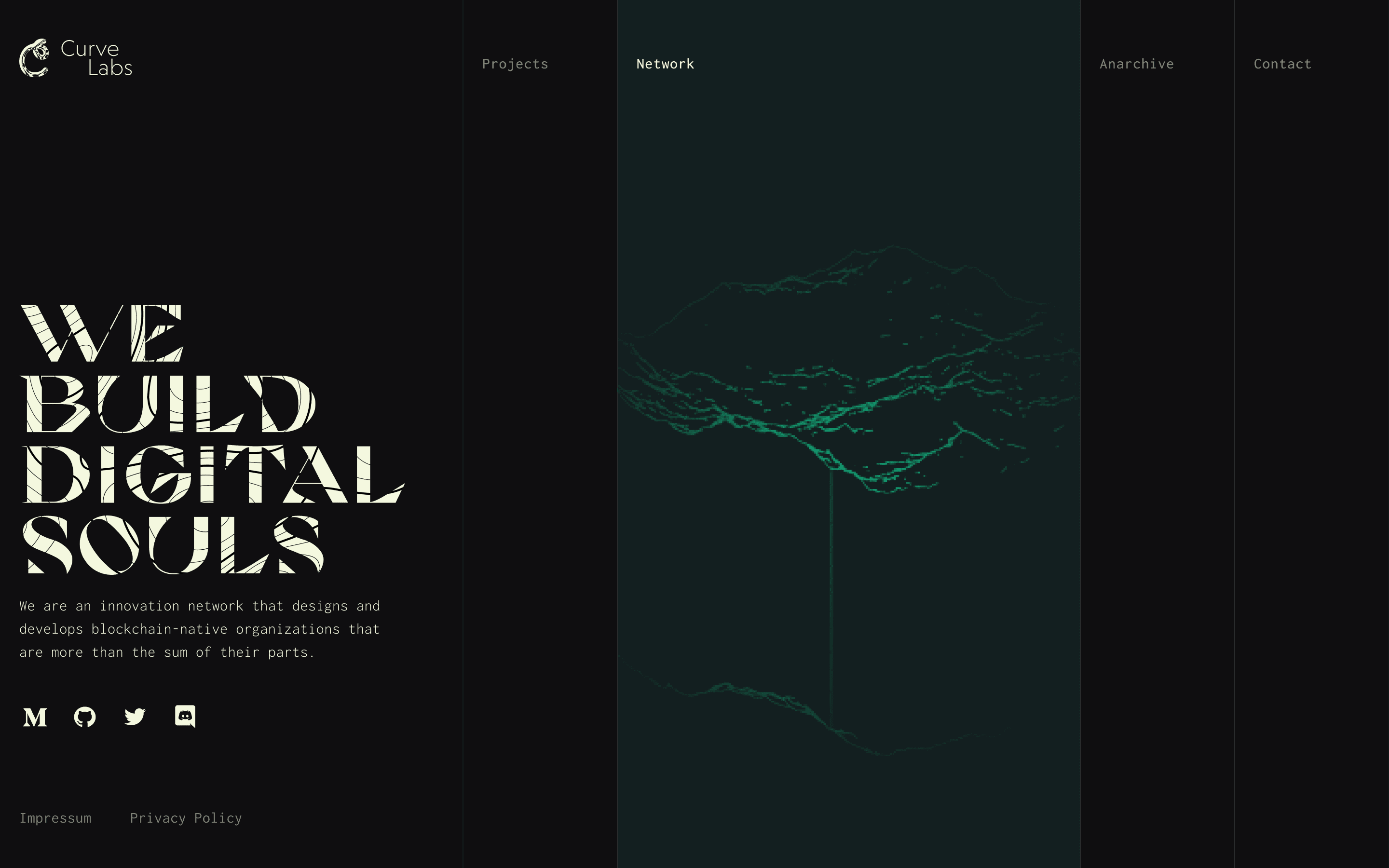
In 2020, I led a four-week redesign of the Curve Labs website, developing a unique identity and digital experience for the multi-faceted organization.
The challenge was to create a website and brand that reflected the lab’s multi-faceted identity and attracted the right people
The lab needed a brand that clearly captured their exploratory ethos without sacrificing mystery. Curiosity was their filter. They had a unique approach to work, and the people willing to look closer were often the people they wanted to attract. The challenge was to create clarity while retaining what made Curve Labs distinctive.
Brand attributes helped us explore the facets of the lab and gave the team a shared language for what made the lab distinctive
I ran collaborative workshops to define goals, target users, and brand attributes. The lab wanted to feel credible to crypto-natives, while remaining intriguing to people drawn to the lab’s way of thinking. Brand attributes helped explore the lab’s many facets.
Several themes emerged, with the strongest ones clustered around a few ideas: architectural and technically informed, but also mysterious, non-conformist, artistic, and free-spirited. These qualities became the foundation for visual exploration.
Three visual directions helped us explore the balance between clarity and mystery
I used different combinations of the brand attributes as starting points for three visual directions, each emphasizing a different facet of what made the lab unique and exploring the relationship between clarity and mystery.
For each direction, we gathered references and explored adjacent ideas as they emerged. Keywords guided the search, but the references also introduced new concepts and keywords worth pursuing, creating a fluid exchange between language and imagery.
A collaborative voting exercise combined the strongest ideas into one system
Together, the three directions resulted in concrete interpretations of what the Curve Labs brand could become. I assembled three visual boards that combined color, typography, textures, and sample layouts to visualize the interpretations.
No single direction captured everything we wanted. Using a collaborative voting exercise, we combined the futurism, artistry, and unconventional layout of one direction with the mystery of another to develop a visual system that would carry across the brand and website.
That combination became a broader system spanning typography, color, imagery, graphic language, layout, and messaging. The result balanced mystery and artistry with a more expressive, experimental character.
The interaction design made curiosity part of the experience
The selected brand attributes extended into layout and behavior. A paneled interface paired animated imagery, expressive typography, and partial reveals to reflect the combination of mystery and artistry.
Visitors initially encountered symbols and motion, with the underlying content revealed on hover. The interaction made discovery part of the experience. Information remained accessible, but curiosity was rewarded with more detail.
The final system balanced clarity, mystery, and experimentation
The final design brought the lab’s positioning and personality into one system, balancing a clearer message with the mystery and experimentation the team wanted to preserve without sacrificing the non-conformity that made the organization distinctive. The deliverable earned a positive response from the lab and helped set them apart.